Feel good and sell even better with website copy rooted in sales psychology, ethical marketing, and your personality.
Reach out today!
Get In Touch →
Website Copy Case Study: Chronius Health
Guiding. Candid. Trustworthy.
Website Copy For A New Healthcare Management Tool
Chronius Health is one of the newest (and most comprehensive) healthcare management tools on the block.
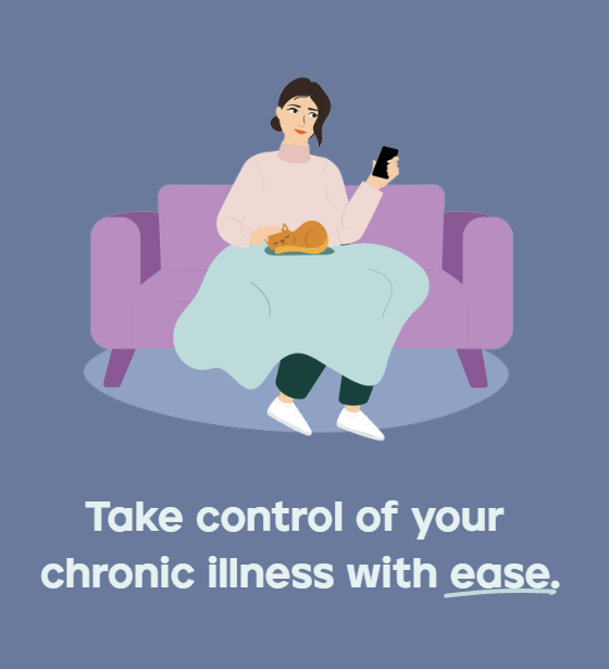
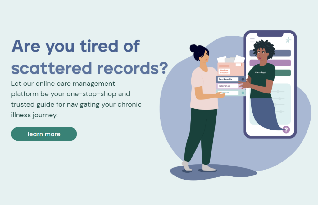
Designed for patients with chronic, invisible, and complex illnesses, Chronius Health eases the burden of managing your health. Say goodbye to binders of health records, a calendar filled with specialist appointments, and scouring Google. Instead, everything you and your care providers need for your healthcare journey fits in the palm of your hand.
Chronius Health’s new website came from an ongoing partnership between Launch It Girl and myself. While the tool has been in development for some time, they were gearing up for their official launch. They needed a website to clearly communicate how their tool helps patients and care providers.
They Needed: Clear and Trustworthy Communication
The team behind Chronius Health understands better than anyone what goes into managing your health because they’ve been through it themselves.
- Tracking medical records, appointments, and medications
- Communicating with specialists and care provider teams
- Navigating multiple patient care platforms
- Recording medical history and symptoms
- Learning medical jargon and research
- Retelling your story
- Questioning the next steps
- Feeling overwhelmed and exhausted
And while there are many different healthcare apps out there offering support in one or two of these areas, Chronius Health does it all. This means they needed to explain a huge amount of features, benefits, and knowledge to their audience of patients and care providers.
What We Did: Complete Website Copy
With Lauren from Launch It Girl, we came up with 3 main goals for the website:
- Complete website copy for the Home Page and Patients page focusing on speaking to patients with complex chronic illnesses.
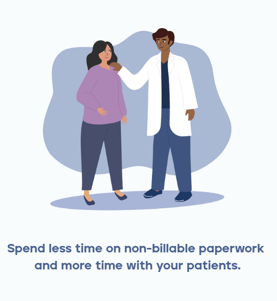
- Complete website copy for the Providers page focusing on speaking to primary care providers.
- Balance the technical features of the management platform with a deep level of empathy.
Since Chronius Health had two different audiences – patients and providers – that had separate problems and needs, we gave each audience its own sales page for the tool. But our approach to the entire website stayed consistent even as we acknowledged the different audiences.
We needed to back up the technical features Chronius Health offered with how these features made a difference in their users’ life.
To do that, I matched each feature with a real-life example of how it impacts patients and providers.
For example:
360 View Of Medical Records: No more binders for patients and no more incomplete medical histories for providers.
Patient Portal Integration: Patients and providers can access all medical records no matter where they’re hosted.
Accessible Data Sharing: Patients can share medical records with their care team while providers can access information with a few clicks of a button.
Care Advocate: Patients get ongoing expert support and providers get more time by passing some care into the hands of a care professional.


Balancing Details, Impact, and Voice
Patients with chronic illnesses have enough jargon to decipher, research to dig through, and communications to manage. So Chronius Health’s messaging needed to give their audience everything they needed to make an informed decision, easily.
This meant showing:
- Empathy, understanding, and emotional support
- Details about the app’s technical features and capabilities
- The real impact Chronius Health makes in the everyday life of its users
Which all weaved together to encourage potential users to join the waitlist and get early access to Chronius Health.
If you’re launching a new way to support your audience, then reach out now! Together, we’ll make sure your services, voice, and impact resonate with your audience and inspire them to partner with you.
The Creatives Guide To Keyword Research
Answer Your Keyword Research Questions With
Discover keywords for your website copy that has Google and your dream clients falling head over keyboard. Get eyes on your page and fingers clicking your ‘book me button’ with this free video training and workbook.
send it to me ⟶
Ask Isobel
Get no-BS answers to your burning copy questions in your inbox every other week.
Writing feel-good web copy that sells for
do-good brands in the creative and adventure industries.
Brand & Website By Samara Bortz Creative | Photos by Kristen Buchholtz & Mollie Laura
Privacy Policy & Terms of Service
Get In My Inbox →
drop a Line →