Feel good and sell even better with website copy rooted in sales psychology, ethical marketing, and your personality.
Reach out today!
Get In Touch →
4 Ways Your Web Copy Brings New Clients To Your Business While You’re Camping
Picture this: you’re deep in the heart of the woods, surrounded by towering trees and the crackle of a late-night campfire. Your phone has been relegated to the role of a glorified reading light and when you get back to the city, your first stop will be the outdoors store to buy that solar-powered camp light you’ve been eyeing.
But here’s the kicker:
While you’ve been busy hiking a mountain and living your best life, your web copy has been busy bringing in new clients (and new ‘invoice paid!’ emails).
But how exactly is your web copy pulling off this feat while you’re off the grid? It’s all thanks to some heavy-lifting copywriting strategies that don’t attract just anyone to your business.
They bring in the exact clients you want to work with. You know, the ones who need your help, connect with your story, and are ready to fill out your application by the time they’ve clicked their way to your contact page.
And trust me, they’re clicking.
1. Bring In New Clients With Magnetic Headlines
Have you heard the statistic that it takes a website visitor only 0.05 seconds to judge your website? It’s true.
Your home page headline (aka hero header or above the fold) is the first impression you make on a reader. It decides whether someone sticks around to learn more about your business or not.
But it’s not just the first headline that matters. All your headlines do.
Why?
‘Cause the truth is most of your website visitors are skimmers. They scan your pages, looking for visuals or copy that grabs them and pulls them in. Which is exactly what your headings should do.
So, your headlines need to capture attention but not from just any old website browser. They need to speak directly to the clients you want to work with and who need your help.
We do that by tapping into your audience’s emotions, showing them you understand their desires, and positioning you as the solution.
The trick? We do it all in just a few sentences.
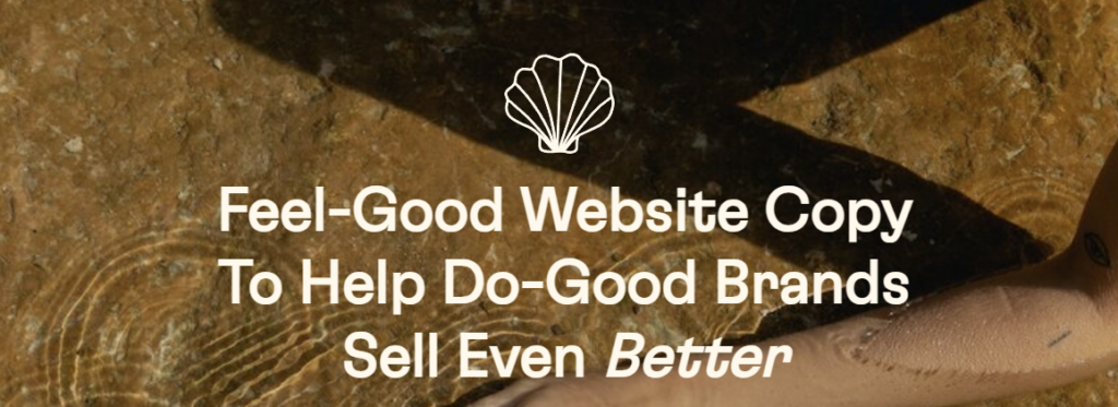
Let me show you how I blended it all on my homepage headling:

2. Appeal To The Heart And Brain With Persuasive Storytelling
Storytelling isn’t just for bedtime or around the campfire – it’s a powerful conversion tool.
Stories engage both the emotional and rational parts of a person. We’re talking about a double whammy heart and brain combination.
When a potential client lands on your website they’re not just looking for a solution. They want to feel seen, heard, and understood. They want a connection.
This is where persuasive storytelling steps in. We craft narratives that hit your audience right in the feels, without making them feel like sh*t, by speaking to their desires, fears, and aspirations.
But it doesn’t stop there.
We also appeal to the logical side of the brain using tactics like compare/contrast and loss aversion to nudge your audience toward action.
And here’s the best part: we do it all without resorting to sleazy sales tactics. No high-stress pressure, no manipulation, no gimmicks – just genuine connection and psychology.
Here’s how I used empathetic storytelling and loss aversion for Miss Tiffany Scarlett:

3. Eliminate Any Confusion, Questions, and Hesitations
Let’s face it: confusion kills conversion.
When potential clients land on your website and can’t figure out who you are, what you offer, or how to take the next step, they’re outta there faster than you can say ‘lost opportunity.’
This is why clarity and transparency are key in your web copy.
By clearly outlining your services, experience, and processes, you foster trust, look legit, and squash any uncertainties your audience might have.
And the real kicker?
Your sales calls become a thing of the past because your leads already know what to expect and are ready to take action.
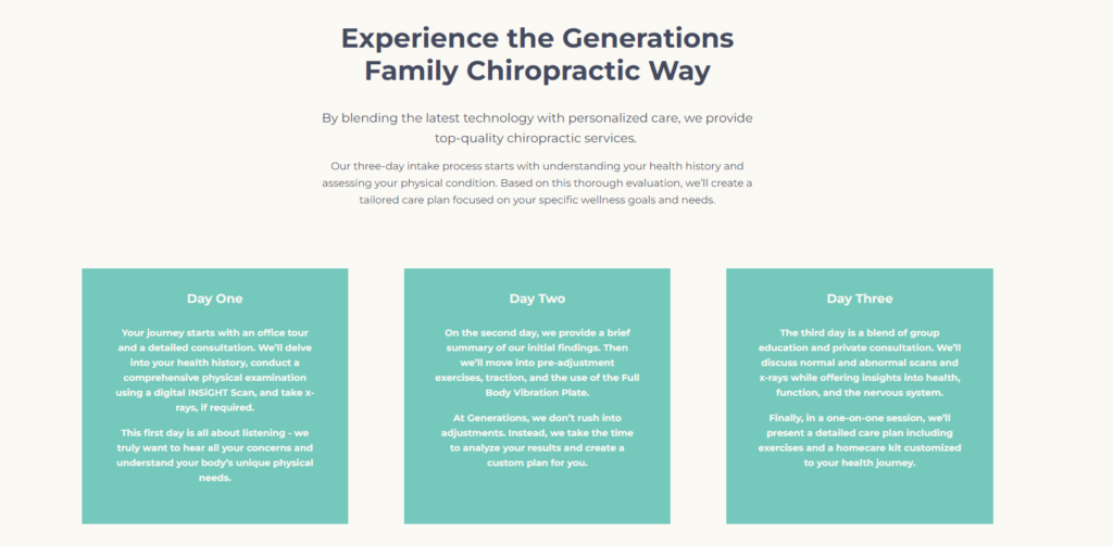
Take a peek at how I streamlined Generations Family Chiropractic’s in-depth intake process for their website visitors:

4. Turn Browsers Into New Clients With Guidance
Your Call To Action is the encouraging nudge that transforms interested browsers into soon-to-be clients. But crafting the perfect CTA requires hitting the perfect Goldilocks balance of motivating but not overwhelming.
By using action-oriented language, being clear on what the next step is, and adding a little (but legit) dose of urgency, you can guide your visitors toward conversion.
Whether you use a simple ‘Apply Now’ or a more fun ‘Let’s Do The Damn Thing!’, your CTAs should be motivating and leave no room for hesitation.
As for how often your CTAs should show up on your website? The easy rule is every scroll or two while the more strategic approach thinks about where your audience is on their customer journey.
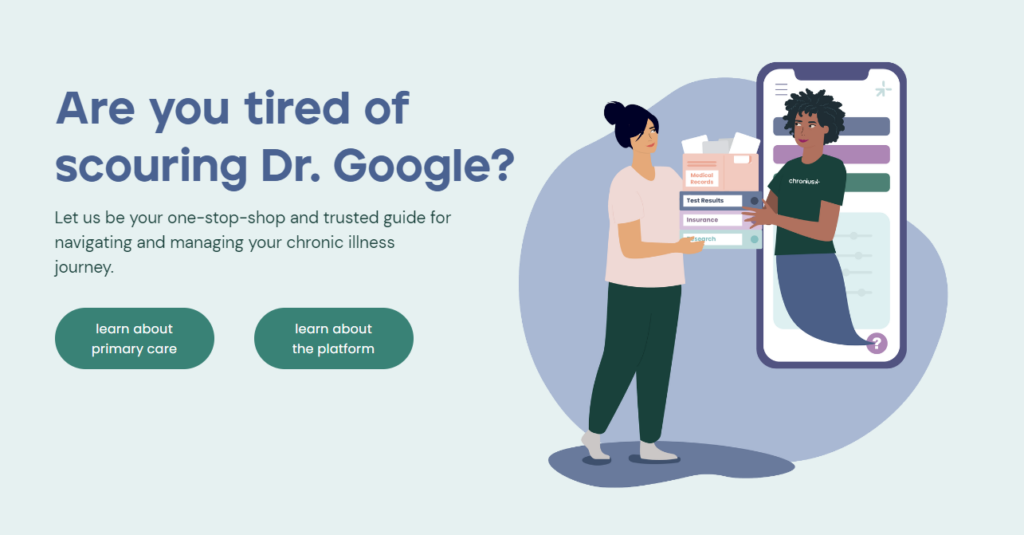
Here’s how I used CTAs to direct Chronius Health’s clients to where they needed to go:

Get Web Copy That Attracts New Clients Anywhere, Anytime
So there you have it – we’ve covered the four ways your web copy can turn your visitors into new clients while you’re exploring the great outdoors.
From crafting headlines that grab attention to weaving stories that resonate, your web copy doesn’t clock out when you do. It’s working tirelessly to attract, engage, and convert potential clients.
Do you have your next adventure marked on your calendar? Then let’s sneak in new web copy before so you can fully unplug on your trip and come back to dream clients in your inbox.
All you have to do is send an inquiry my way!
The Creatives Guide To Keyword Research
Answer Your Keyword Research Questions With
Discover keywords for your website copy that has Google and your dream clients falling head over keyboard. Get eyes on your page and fingers clicking your ‘book me button’ with this free video training and workbook.
send it to me ⟶
Ask Isobel
Get no-BS answers to your burning copy questions in your inbox every other week.
Writing feel-good web copy that sells for
do-good brands in the creative and adventure industries.
Brand & Website By Samara Bortz Creative | Photos by Kristen Buchholtz & Mollie Laura
Privacy Policy & Terms of Service
Get In My Inbox →
drop a Line →