

This Is What The Best Physiotherapy Websites Get Right
Your patients come to you when something’s out of alignment. Maybe their knee sounds like a bowl of Rice Krispies, or their back throws a tantrum whenever they try to stand up.
And you? You know exactly how to get them moving again.
But when was the last time your physiotherapy website got that kind of care?
Because just like an untreated injury, a neglected website doesn’t magically get better. If your site is vague, cluttered, or reads like a Wikipedia entry on joint pain, it’s probably not doing much to bring in your right-fit clients.
The best physical therapy websites?
They don’t say “We help people move better” and call it a day. They show what makes your clinic different, prove you know your stuff, and make booking feel like the easy, obvious next step.
So let’s look at some of the best in the game—what they’re getting right, and what you might want to borrow for your clinic.

5 Signs Your Physiotherapy Website Needs Some Rehab
Here’s how to tell if your website is limping along instead of running at full strength.
❌ It looks outdated compared to your competitors
If your website still has that “made in 2012” energy, potential clients will assume your treatments are outdated too. Fair? No. But first impressions matter.
❌ You’re basically WebMD with a booking button
If your site is packed with medical jargon and symptom deep-dives, clients are more likely to self-diagnose than book an appointment ‘cause it seems like less of a headache.
❌ Your positioning is unclear, so you’re getting the wrong clients
Are you a sports rehab clinic but getting calls about workplace injuries? A pediatric physio but constantly explaining you don’t treat adults? If your website doesn’t make your specialty clear, you’re wasting time on calls that aren’t a fit.
❌ You don’t give people a reason to trust you
No reviews, no patient stories, no proof that real people have come to you and actually felt better? If your website isn’t showing your experience, potential clients will move on to a clinic that does.
❌ Booking feels like more effort than it’s worth
Do they need a referral? Which service is right? If your website makes booking feel like a guessing game, most people will just put it off…and keep dealing with their wonky knee for another six months.
What The Best Physical Therapy Websites Have In Their Treatment Plan
Some websites make you work harder to book an appointment than the actual rehab exercises. But the best physical therapy websites? They keep it simple, clear, and damn near impossible to second-guess. Here’s what they’re getting right.
Alta Physio
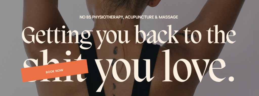
Alta Physio’s website doesn’t waste time with fluffy “we help you move better” messaging. The second you read their hero header, you know what kind of clinic you’re signing up with. It’s direct, confident, and a little edgy—just like their approach to treatment.
Then their service page keeps things client-focused. Alta Physio knows you don’t need a lecture in biomechanics to book an appointment. You just need to know your physios know their stuff and what to expect. And that’s exactly what they deliver with quick, no-fuss breakdowns of each treatment.
As for Alta’s about page? That’s where they really shine.
Instead of the usual ‘We’re passionate about physical therapy’ spiel, they call out why people get frustrated with physio—rushed, impersonal sessions that don’t fix the issue. Then they position themselves as on your side and the solution to those exact problems.
✅ What to steal for your own site: Don’t be afraid to ditch the stiff, corporate tone if that’s not your vibe! You can be casual, bold, and even silly and still be a trusted expert.
VI Physiotherapy
VI Physiotherapy’s website doesn’t just talk about setting a new standard—it feels like one.
From the moment you land on their homepage, everything about the design, copy, and layout says this is the highest level of care. And they’ve got the receipts—30+ years of experience, stacked credentials—but instead of dumping that info like a LinkedIn résumé, they frame it around why it matters for you.
Rather than burying each service in separate pages (because let’s be honest, no one wants to play “find the treatment info”), VI Physiotherapy keeps everything streamlined. Their services are all in one place, but the layout is smart and makes it easy for visitors to skim, find what they need, and move on without information overload.
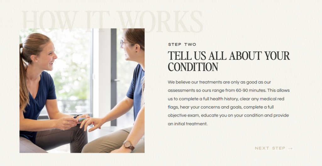
And if you’re feeling a little nervous about booking? They’ve already thought of that.
VI Physiotherapy walks you through the process so you know exactly what to expect—so booking an appointment feels reassuring, not overwhelming.
✅ What to steal for your own site: Keep things simple and intuitive. You might not need a separate page for every service—just a layout that helps people find what they need fast.
Tall Tree Health
Tall Tree Health is huge. We’re talking multiple locations, and a full roster of services—physio, massage, kinesiology, counseling, and more. A clinic this big could be a logistical nightmare, but their website is a well-oiled machine…or well-lubricated synovial joint.
The secret? Every service page follows a clear, easy-to-skim format:
✔ What it is – No vague jargon, just a quick breakdown.
✔ How it helps – Why you’d actually want this treatment.
✔ What to expect – So you’re not left wondering, Are they going to snap my back like a glowstick?
✔ Who you’ll work with – Making it feel personal, not like booking with some faceless clinic.
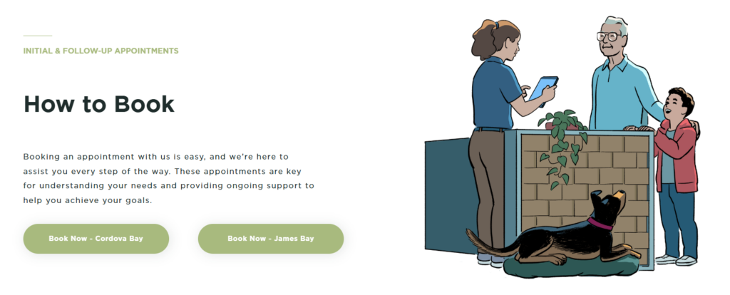
✔ How to book – Because if you make people hunt for the booking button, they won’t bother.
They actually thought about how real people search for healthcare. No guesswork, no endless clicking—just a clear, structured path from curious to booked with minimal effort.
And despite its size, Tall Tree’s site doesn’t have that cold, corporate hospital vibe. The warm, conversational tone makes even the more technical descriptions feel accessible.
✅ What to steal for your own site: If you offer a bunch of services, don’t make people work to find what they need. Keep it simple, clear, and easy to skim—or they’ll just put off booking (again).
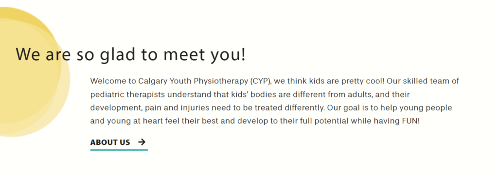
Calgary Youth Physiotherapy
Okay, full disclosure—I’m a little biased here. This was my physio growing up (shoutout to dance injuries), and my first job was answering phones at the front desk.
Personal history aside, Calgary Youth Physiotherapy gets what a pediatric physio clinic needs to do: reassure parents while making kids feel comfortable.
Physio for kids isn’t only about the child—it’s about reassuring the parents that they’re making the right choice. Calgary Youth Physiotherapy absolutely nails this balance by using a voice that’s friendly, warm, and professional without being overly clinical.
Plus, they break their services down by age and condition so parents don’t have to wade through a wall of text. Instead, they can jump straight to what’s relevant, whether it’s sports injuries, developmental concerns, or post-surgical care.
But the best part? The site removes fear.
It explains the process in a way that feels approachable and human, so parents aren’t left stressing over whether physio is the right move, and kids aren’t picturing some terrifying, sterile clinic experience.
✅ What to steal for your own site: If you serve a specific audience, talk to them like a real person—not a textbook. Use a familiar voice that meets them where they are and makes them feel seen.
The Best Physical Therapy Websites Don’t Make Clients Work Harder Than Leg Day
You wouldn’t tell a patient to just hope their knee stops clicking or wait and see if their back magically fixes itself. You’d give them a treatment plan—because without one, they’re stuck in the same frustrating cycle, dealing with the same pain, getting the same results.
Your website works the same way.
If it’s not bringing in the right clients, making booking easy, or giving people a reason to trust you, it’s actively holding your business back. And the best physical therapy websites? They don’t leave all that to chance.
They show what makes the clinic different. They make it obvious why someone should book. And they remove every last bit of friction so no one gets overwhelmed and thinks, eh, I’ll deal with it later.
And if your website isn’t doing that, I can help.
I write feel-good website copy that helps you book your right-fit clients. Because selling your services shouldn’t feel like pulling a hamstring—it should feel like that sweet, satisfying moment when a client finally listens, does their damn rehab, and realizes, oh wow, this actually works.
The Creatives Guide To Keyword Research
Answer Your Keyword Research Questions With
Discover keywords for your website copy that has Google and your dream clients falling head over keyboard. Get eyes on your page and fingers clicking your ‘book me button’ with this free video training and workbook.

send it to me ⟶
